
Showing posts with label 3/10. Show all posts
Showing posts with label 3/10. Show all posts
Wednesday, March 2, 2011

Sunday, January 16, 2011
Final Post...
...on the matter of the 3/10 MACD oscillator and how to effectively use it for intra-day trading. Other posts on the subject can be referenced HERE and HERE. While previous posts dealt mostly with the construction of the indicator and price relationships used with it, this post will be a bit different.
If you are unfamiliar with this blog then you may also want to refer to the "Doc.s on Request" (sidebar to the right) for further 3/10 macd references.
What we know-
There are two lines on the 3/10 macd; one indicates the difference between two moving averages (3- & 10-period), known as the "Fast Line" (also represented by the histogram) and one which indicates a moving average of that difference (a 16-period moving average of the 3- & 10-period differential) known as the "Slow Line". Think of it this way:
Slow Line = an intermediate-term trend indication
Fast Line = short-term trend indication.
(as an aside; a Long-term trend indication can be a reasonably reliable Moving Average, like the 50-period, or a 20- & 50-period Moving Average that takes into account the orientation and slope of the two MA's (20- above 50-period and Up is bullish).
So, the 3/10 MACD provides 2 layers of price; one which directly reflects price (the Fast Line), and one which is slightly removed from price, being that it's a moving average of the difference between two moving averages (the Slow Line).
The above concepts are slightly less important than the one to follow regarding time frame layers.
Time Frame Layers:
We learn early on that it is important to understand what higher time frames are doing if we intend to trade a lower time frame. For the purpose of intraday trading we can not ignore the one chart which is likely studied upon, and made decisions off of the most in our line of work, the Daily chart. We have to know where we stand in the daily time frame before all else. In so doing, we should try to keep things simple. Are we trending or within a range? Where is likely support/resistance? With those questions answered we can then approach our intraday analysis.
My personal preference is for having a 15-min and 5-min chart as an Intermediate and Short-term indication of price. Trades are taken off of the 5-min chart but only if the other two charts confirm my interpretation of price. The way in which I like to set screens up is my own, most important is to use what you feel comfortable with. That being said, my screen for the 3/10 MACD strategy is set up as follows:

I use a 65-min chart simply because it divides into 390 evenly (the number of minutes in a trading day) and so we have each bar containing the same amount of data. On this 65-min. chart I have two moving averages and the 3/10 macd set up so that they reflect the DAILY chart. So, this 65-min chart shows me what it is the 20- & 50-Day moving averages are doing, as well as what the Daily 3/10 indicator is doing. The other two charts (15-min & 5-min) only contain the 3/10 oscillator, reflective of their individual time frame.
How it works:
First and foremost I want to know what the Daily chart is telling me. Is the long-term trend (reasonably reliable Moving Averages) up, down or sideways? Is the Intermediate-term trend (the Slow Line) up, down, or sideways? Is the short-term trend (Fast Line) pointing up, down, or sideways?
I'm using the symbol APA simply because that is what opened up when starting my charting program. So, I'll just stick with my original example from above.
In the above example it is easy to see that the trend is Up. We have both the 20- & 50-day Moving Averages sloping up and we have a green (Up) histogram with a slow line above the zero-line and sloping Up.
Since continuation is more likely than change in trading, I only want to look for long entries when the Daily chart meets the above criteria (bullish Moving Average orientation, Slow & Fast Line above zero). There are some nuances that will amend the previous sentence, but I'll get into more complex situations later.
Entries:
OK, so we are bullish on APA because the daily meets the previously explained criteria. Where do we enter?
First, we want the Intermediate-term trend (in this case the 15-min chart) to tell us when price is starting to look bullish. Second, the short-term trend will tell us when to enter (since this IS short-term trading) in anticipation of price continuing on it's already determined bullish course.

Keep in mind; there are at least two approaches to this strategy; the aggressive (anticipatory) entries and the conservative (confirmed) entries. Instinct and personal preference will dictate which you follow. So in the above chart we have two highlighted up arrows on the 15-min chart to tell you when things are looking bullish in terms of the 3/10 oscillator.
Two signals:
- Fast Line crosses the Slow Line
- Fast Line crosses the zero-line (histogram changes from negative to positive or from red to green).
Being that we have a strongly bullish Daily chart we may consider a more aggressive third signal:
- Fast Line begins to move counter to the previous trend (in the chart above, the middle 15-min chart has an up arrow that is not highlighted. This up arrow indicates where the 3/10 histogram began to "tick up" and move counter to the previous lower low readings one bar before the fast line crosses above the slow line.
The reason for this discretionary third signal is due to the fact that the 5-min chart is showing a momentum buy divergence on a double-bottom, and if we can anticipate an early entry our Risk:Reward will be greatly maximized.
Here's another example, using the SPY. Again, the higher time frame was bullish (fast line above slow line and above zero), so it was a matter of waiting for the intermediate term to confirm and the traded time frame to signal an entry.

The 15-min chart indicated a bullish bias right at the open (actually showed a bullish divergence on the close of the previous day setting up a buy entry for the next bar) while the 5-min chart was a matter of waiting for the first pullback to enter.
Now on to some less straightforward examples (though it makes a lot more sense to me to only search for and trade charts that show a straightforward bias ;)
Taking it to the next level
Context:
Starting with the Daily chart helps to keep everything faster than a daily chart within context. So, what are the two lines doing on our daily 3/10? There are a combination of scenarios possible for our 3/10 MACD indicator, and each scenario tells us something about what price is doing (bare with me here):
We can have the following scenarios:
1). A Positive Slow Line (above zero) trending higher, with:
(a) a positive Fast Line ticking higher
(b) a positive Fast line ticking lower
(c) a negative Fast line ticking lower
(d) a negative Fast Line ticking higher
2). A positive Slow Line trending Down, with the same set of criteria as above (a through d) for the Fast Line.
3). A negative Slow Line that is trending Up, while the Fast Line meets one of the above criteria (a through d).
And, finally,
4). A negative Slow Line which is trending Down, while the Fast Line meets one of the aforementioned situations (a through d).
In all, a total of 16-possible scenarios, and I intend on covering them all (there was a reason this was intended to be my last post on this subject). I made this spreadsheet to reference (just request viewing permission) so you don't have to scroll back up.
1a. Positive Slow Line trending Up with a Positive Fast Line ticking higher, like so:

This condition illustrates trend continuation or breakout moves which happen to be MOST dramatic when it is occurring in tandem with a Slow line crossing positive (as was the case in March '10, shown above more closely), they can also indicate short-term tops once the Fast Line begins to tick lower:

1b. Positive Slow Line trending higher, with the Fast line positive and ticking lower; This happens a lot more frequently, and often indicates a mean regression of some sort, or a consolidation phase. like so:

1c. Positive Slow Line trending Up, with the Fast line negative and ticking Down.
This isn't a frequent occurrence either. For a similar reason as 1c, typically the Slow Line will be trending down. Consolidation or pullbacks, but watch for breakouts/breakdowns.

1d. Slow Line positive and trending Up with the Fast Line Negative but trending Up, I don't really see this combination happening since when the fast line is negative trending up the Slow Line will typically be trending down. So if you see it, you may be in a choppy range.
2a. A positive Slow Line trending Down with a Positive Fast Line trending Up. Typical of range expansion or continuation of trend. Watch for a double top and/or divergence.

2b. A positive Slow Line trending Down with a Positive Fast Line trending Down. Indicative of range or waning momentum, but watch for breakouts/breakdowns.

2c. A positive Slow Line trending Down with a Negative Fast Line trending Down. Strong pullback of the previous trend that can lead to a bottoming move. Look for reverse divergence. If the slow line is dragged negative a lower high could start a bearish trend.

2d. A positive Slow Line trending Down with a Negative Fast Line trending Up. Doesn't occur very often (on the daily timeframe), but often indicative of a pullback prior to a continuation of previous momentum. This will often set up criteria 4c where the slow line is dragged negative. Can lead to the fast line resetting green and trapping shorts.
Notice on the last highlighted rectangle in Nov., price pulled back and moved for a continuation, but then squeezed longs in the morning star pattern that followed, so it technically didn't "work".

3a. Negative Slow Line trending Up with a Positive Fast Line trending Up. Could be a pullback of previous momentum, or test of Resistance? Could be a breakout move following a divergence if slow line is near zero. Should momentum carry the Slow line positive, the first pullback is a high expectancy setup long.


3b. Negative Slow Line trending Up with a positive Fast Line trending Down. Usually highlights a consolidation pullback or test of Support. Price can drift higher as the momentum wanes.

3c. Negative Slow Line trending Up with a Negative Fast Line ticking Down. Didn't find but a handful of these on the past two years of the SPY. They almost always highlight a divergence or pullback after a momentum move. Where is Support?
 3d. Negative Slow Line trending Up with a Negative Fast Line trending Up. Another infrequent occurrence (on the daily); infrequent because it's not long before the fast line crosses zero (histogram turns green) setting up a 3a. If all we can do as a trader is "anticipate" a move then this is a valuable condition to be aware of.

4a. A Negative Slow Line trending Down with a Positive Fast Line trending Up. A pullback following an initial impulse move. The histogram turning green is typically brief.

4b. A Negative Slow Line trending Down with a Positive Fast Line trending Down. I would clump this one together with 4a. Watch for continuation of previous momentum.
4c. A Negative Slow Line trending Down with a Negative Fast Line trending Down. Bearish trend continuation. Trade in the direction of the trend.

4d. A Negative Slow Line trending Down with a Negative Fast Line trending Up. Pullbacks. Consolidation. Know your range.

So, there you have it! If we know the context of price we can have a clearer idea of what to anticipate.
If you are unfamiliar with this blog then you may also want to refer to the "Doc.s on Request" (sidebar to the right) for further 3/10 macd references.
What we know-
There are two lines on the 3/10 macd; one indicates the difference between two moving averages (3- & 10-period), known as the "Fast Line" (also represented by the histogram) and one which indicates a moving average of that difference (a 16-period moving average of the 3- & 10-period differential) known as the "Slow Line". Think of it this way:
Slow Line = an intermediate-term trend indication
Fast Line = short-term trend indication.
(as an aside; a Long-term trend indication can be a reasonably reliable Moving Average, like the 50-period, or a 20- & 50-period Moving Average that takes into account the orientation and slope of the two MA's (20- above 50-period and Up is bullish).
So, the 3/10 MACD provides 2 layers of price; one which directly reflects price (the Fast Line), and one which is slightly removed from price, being that it's a moving average of the difference between two moving averages (the Slow Line).
The above concepts are slightly less important than the one to follow regarding time frame layers.
Time Frame Layers:
We learn early on that it is important to understand what higher time frames are doing if we intend to trade a lower time frame. For the purpose of intraday trading we can not ignore the one chart which is likely studied upon, and made decisions off of the most in our line of work, the Daily chart. We have to know where we stand in the daily time frame before all else. In so doing, we should try to keep things simple. Are we trending or within a range? Where is likely support/resistance? With those questions answered we can then approach our intraday analysis.
My personal preference is for having a 15-min and 5-min chart as an Intermediate and Short-term indication of price. Trades are taken off of the 5-min chart but only if the other two charts confirm my interpretation of price. The way in which I like to set screens up is my own, most important is to use what you feel comfortable with. That being said, my screen for the 3/10 MACD strategy is set up as follows:

I use a 65-min chart simply because it divides into 390 evenly (the number of minutes in a trading day) and so we have each bar containing the same amount of data. On this 65-min. chart I have two moving averages and the 3/10 macd set up so that they reflect the DAILY chart. So, this 65-min chart shows me what it is the 20- & 50-Day moving averages are doing, as well as what the Daily 3/10 indicator is doing. The other two charts (15-min & 5-min) only contain the 3/10 oscillator, reflective of their individual time frame.
How it works:
First and foremost I want to know what the Daily chart is telling me. Is the long-term trend (reasonably reliable Moving Averages) up, down or sideways? Is the Intermediate-term trend (the Slow Line) up, down, or sideways? Is the short-term trend (Fast Line) pointing up, down, or sideways?
I'm using the symbol APA simply because that is what opened up when starting my charting program. So, I'll just stick with my original example from above.
In the above example it is easy to see that the trend is Up. We have both the 20- & 50-day Moving Averages sloping up and we have a green (Up) histogram with a slow line above the zero-line and sloping Up.
Since continuation is more likely than change in trading, I only want to look for long entries when the Daily chart meets the above criteria (bullish Moving Average orientation, Slow & Fast Line above zero). There are some nuances that will amend the previous sentence, but I'll get into more complex situations later.
Entries:
OK, so we are bullish on APA because the daily meets the previously explained criteria. Where do we enter?
First, we want the Intermediate-term trend (in this case the 15-min chart) to tell us when price is starting to look bullish. Second, the short-term trend will tell us when to enter (since this IS short-term trading) in anticipation of price continuing on it's already determined bullish course.

Keep in mind; there are at least two approaches to this strategy; the aggressive (anticipatory) entries and the conservative (confirmed) entries. Instinct and personal preference will dictate which you follow. So in the above chart we have two highlighted up arrows on the 15-min chart to tell you when things are looking bullish in terms of the 3/10 oscillator.
Two signals:
- Fast Line crosses the Slow Line
- Fast Line crosses the zero-line (histogram changes from negative to positive or from red to green).
Being that we have a strongly bullish Daily chart we may consider a more aggressive third signal:
- Fast Line begins to move counter to the previous trend (in the chart above, the middle 15-min chart has an up arrow that is not highlighted. This up arrow indicates where the 3/10 histogram began to "tick up" and move counter to the previous lower low readings one bar before the fast line crosses above the slow line.
The reason for this discretionary third signal is due to the fact that the 5-min chart is showing a momentum buy divergence on a double-bottom, and if we can anticipate an early entry our Risk:Reward will be greatly maximized.
Here's another example, using the SPY. Again, the higher time frame was bullish (fast line above slow line and above zero), so it was a matter of waiting for the intermediate term to confirm and the traded time frame to signal an entry.

The 15-min chart indicated a bullish bias right at the open (actually showed a bullish divergence on the close of the previous day setting up a buy entry for the next bar) while the 5-min chart was a matter of waiting for the first pullback to enter.
Now on to some less straightforward examples (though it makes a lot more sense to me to only search for and trade charts that show a straightforward bias ;)
Taking it to the next level
Context:
Starting with the Daily chart helps to keep everything faster than a daily chart within context. So, what are the two lines doing on our daily 3/10? There are a combination of scenarios possible for our 3/10 MACD indicator, and each scenario tells us something about what price is doing (bare with me here):
We can have the following scenarios:
1). A Positive Slow Line (above zero) trending higher, with:
(a) a positive Fast Line ticking higher
(b) a positive Fast line ticking lower
(c) a negative Fast line ticking lower
(d) a negative Fast Line ticking higher
2). A positive Slow Line trending Down, with the same set of criteria as above (a through d) for the Fast Line.
3). A negative Slow Line that is trending Up, while the Fast Line meets one of the above criteria (a through d).
And, finally,
4). A negative Slow Line which is trending Down, while the Fast Line meets one of the aforementioned situations (a through d).
In all, a total of 16-possible scenarios, and I intend on covering them all (there was a reason this was intended to be my last post on this subject). I made this spreadsheet to reference (just request viewing permission) so you don't have to scroll back up.
1a. Positive Slow Line trending Up with a Positive Fast Line ticking higher, like so:

This condition illustrates trend continuation or breakout moves which happen to be MOST dramatic when it is occurring in tandem with a Slow line crossing positive (as was the case in March '10, shown above more closely), they can also indicate short-term tops once the Fast Line begins to tick lower:

1b. Positive Slow Line trending higher, with the Fast line positive and ticking lower; This happens a lot more frequently, and often indicates a mean regression of some sort, or a consolidation phase. like so:

This isn't a frequent occurrence either. For a similar reason as 1c, typically the Slow Line will be trending down. Consolidation or pullbacks, but watch for breakouts/breakdowns.

1d. Slow Line positive and trending Up with the Fast Line Negative but trending Up, I don't really see this combination happening since when the fast line is negative trending up the Slow Line will typically be trending down. So if you see it, you may be in a choppy range.
2a. A positive Slow Line trending Down with a Positive Fast Line trending Up. Typical of range expansion or continuation of trend. Watch for a double top and/or divergence.

2b. A positive Slow Line trending Down with a Positive Fast Line trending Down. Indicative of range or waning momentum, but watch for breakouts/breakdowns.

2c. A positive Slow Line trending Down with a Negative Fast Line trending Down. Strong pullback of the previous trend that can lead to a bottoming move. Look for reverse divergence. If the slow line is dragged negative a lower high could start a bearish trend.

2d. A positive Slow Line trending Down with a Negative Fast Line trending Up. Doesn't occur very often (on the daily timeframe), but often indicative of a pullback prior to a continuation of previous momentum. This will often set up criteria 4c where the slow line is dragged negative. Can lead to the fast line resetting green and trapping shorts.
Notice on the last highlighted rectangle in Nov., price pulled back and moved for a continuation, but then squeezed longs in the morning star pattern that followed, so it technically didn't "work".

3a. Negative Slow Line trending Up with a Positive Fast Line trending Up. Could be a pullback of previous momentum, or test of Resistance? Could be a breakout move following a divergence if slow line is near zero. Should momentum carry the Slow line positive, the first pullback is a high expectancy setup long.


3b. Negative Slow Line trending Up with a positive Fast Line trending Down. Usually highlights a consolidation pullback or test of Support. Price can drift higher as the momentum wanes.


4a. A Negative Slow Line trending Down with a Positive Fast Line trending Up. A pullback following an initial impulse move. The histogram turning green is typically brief.

4b. A Negative Slow Line trending Down with a Positive Fast Line trending Down. I would clump this one together with 4a. Watch for continuation of previous momentum.
4c. A Negative Slow Line trending Down with a Negative Fast Line trending Down. Bearish trend continuation. Trade in the direction of the trend.

4d. A Negative Slow Line trending Down with a Negative Fast Line trending Up. Pullbacks. Consolidation. Know your range.

So, there you have it! If we know the context of price we can have a clearer idea of what to anticipate.
Tuesday, November 23, 2010
GLD
GLD is setting something up here. As the SPY yesterday set up the potential for a First Cross Sell signal, the GLD is setting up a similar pattern (of course we're noticing the Head & Shoulders pattern forming, which you often get with a first cross entry). Price stalled today at the 50% retracement level following the most recent selling momentum. At this point we would be looking for a tick lower in the momentum histogram along with the slow line crossing negative:


breached
The Lower Median Line of our Pitchfork was breached today, while the 50-day lies just below (as an aside, price opened RIGHT ON the midpoint of a previous 2x-bar)

Also got a First Cross Sell signal. Caution is warranted at this point as the slow line has yet to follow-through and go negative.

Intraday, we opened on the aforementioned 2x-bar midpoint, while the lows today were made on the confluence of a 50% extension off of yesterday's range and a 50% extension of the PDC to today's Open:


Also got a First Cross Sell signal. Caution is warranted at this point as the slow line has yet to follow-through and go negative.

Intraday, we opened on the aforementioned 2x-bar midpoint, while the lows today were made on the confluence of a 50% extension off of yesterday's range and a 50% extension of the PDC to today's Open:

Monday, November 22, 2010
Back to the 20MA
SPY bounced at the Lower Median Line again (actually fell within 18-cents) which also coincided with the midpoint of a previous 2x-bar.


intraday look at the SPY which formed a hammer candle 7-cents away from the 2x-bar median line

Fib levels as measured from the most recent high to the corrective low. Price is basing under that 50% level

The 3/10 Macd has the potential to form a First Cross sell signal here, otherwise we get another momentum push up and possibly turn into a Sell divergence should price make new highs (much the way it signaled a first cross sell in Aug. only to form a buy divergence 5-days later). We could still push up to the 61.8% - 78.6% retracement on nil momentum and get our First Cross entry on the following tick down in the momentum histogram.


intraday look at the SPY which formed a hammer candle 7-cents away from the 2x-bar median line

Fib levels as measured from the most recent high to the corrective low. Price is basing under that 50% level

The 3/10 Macd has the potential to form a First Cross sell signal here, otherwise we get another momentum push up and possibly turn into a Sell divergence should price make new highs (much the way it signaled a first cross sell in Aug. only to form a buy divergence 5-days later). We could still push up to the 61.8% - 78.6% retracement on nil momentum and get our First Cross entry on the following tick down in the momentum histogram.

Tuesday, November 16, 2010
no indicator day
Trading off of a momentum indicator on a trend day like today would have you screwed six ways to Sunday. Here's what buying a momentum divergence left you with today on the 15-min:

While on the 5-minute one would be sliced and diced:
So, on a day when Advancers/Decliners are severely out of balance, the TICK starts of with -1000 and can barely get back to zero, and the rest of the breadth indicators are flashing sell, just turn the squiggly line indicator off.
What were some reasonable targets to aim for?
Fib Retracement as measured between the PDC and today's Open had a great proportion:
 and the Fib retracement off of the PDH & PDL had similar results


While on the 5-minute one would be sliced and diced:

So, on a day when Advancers/Decliners are severely out of balance, the TICK starts of with -1000 and can barely get back to zero, and the rest of the breadth indicators are flashing sell, just turn the squiggly line indicator off.
What were some reasonable targets to aim for?
Fib Retracement as measured between the PDC and today's Open had a great proportion:


Saturday, November 13, 2010

Sunday, October 17, 2010
3/10 revisited
~ I have changed the original body of this blog post. ~
I thought I would go over this indicator once again with (hopefully) a clearer explanation and elaborate on some of it's subtleties.
Also, see this post.
The important stuff:
An indicator can be helpful in the sense that it is not subjective. Where one may think they see a bull flag, an indicator pattern can help you pick up what the eye may not see. However, it shouldn't be a replacement for individual price bars and paying attention to what they may be telling you in the context of the overall mood of the trading environment.
That being said, many useful conditions of the 3/10macd can help you to spot higher probability setups.
If you don't already know, the components of this indicator include a zero line (giving readings above as positive and below as negative), a Fast line (the fast line and the histogram are the same thing; it shows the difference between the 3- & 10-SMA) and a Slow line (16-period average of the difference between the 3- & 10-SMA's).
Start with the Daily:
To keep it simple, you want to see what the 3/10 line (histogram, aka fast line) is doing. Is it increasing or decreasing?

Below, simply the fast line going up shows price moving up and the fast line moving down coinciding with price moving down:

There are some instances (a short squeeze environment in particular) where the 3/10macd fast line is not necessarily indicative of price direction. Just because momentum (this IS a momentum oscillator) is decreasing does NOT mean price "should" be decreasing (in fact, the reason it may be going up is because short sellers keep getting stopped out). So, context is critical.

Now, retaining the Daily chart's information, we can incorporate an intra-day time frame to give us a dual time frame context.
In the 30-min chart below I included a macd histogram that depicts what is happening on the daily chart (top subgraph) while the lower subgraph indicates the regular 30-min 3/10macd.
We are looking at the location and slope of the slow line for a higher time frame direction bias while using the intra-day 3/10 macd as a timing mechanism, but don't forget to take the long-term trend (20- & 50- SMA's) into consideration.
So, in the chart below, the long-term trend (20- & 50-SMA's) is bearish, but the Intermediate trend (higher time frame 3/10macd) is clearly bullish ("bullish" only in the sense that the average smoothed price is increasing for the time being). Being that the "long-term trend" is bearish we can consider a long entry as being "counter-trend" and, therefore, having a shorter holding period.

This is a bigger edit than I was anticipating.....I am going to leave the remainder of this blog post as it is, though it doesn't quite segue well with the information above.
Now what?:
Now you have a direction bias. In this case, the bias is bullish, so one would look for setups that include (but are not limited to) bullish breakouts, pullbacks, fading lows.
Starting with the day in which our histogram went green (6/11) let's dial in to see if any signals were given.

Now let's move to the following day which proved difficult for our bullish bias (as an aside; just because a bias is bullish doesn't mean price won't pull back, retrace, flash-crash, etc.)
We got a late-day run-up in price (momentum) that carried over into this day (bullish so far). Price didn't give up the gap and with our bullish bias we were looking to trade a pullback or breakout, which we got in the morning session. It was at this point that price stalled.

OK, so what happens after momentum in price? Pullbacks (and buyers looking to enter in pullbacks) happen after momentum in price. We just never know how steep the pullback will extend (how interested buyers are).
A couple of things to look at:
Higher intra-day time frame told us momentum kept dropping as price advanced (bearish)
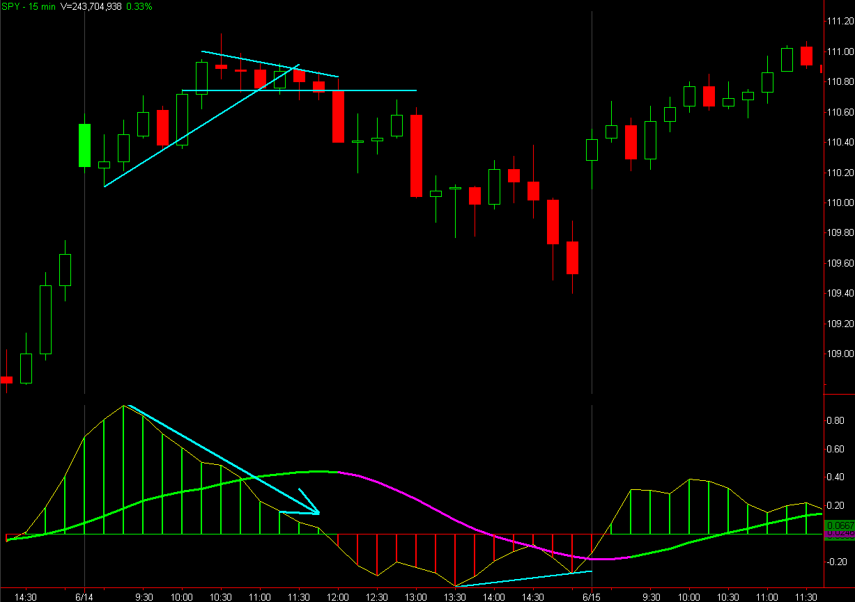

Just because we have a bullish bias doesn't mean we can't take a counter-trend trade, like perhaps a First Cross Sell signal (red vertical dash line) as long as we have realistic targets in mind. Also being aware that towards the end of the day both intra-day time frames (5- & 15-min) were showing a bullish momentum divergence (and the next day happened to be a trend-day up, the type of day you need to completely ignore the 3/10 macd).
OK, let's take a look at the next few Bullish Bias days after the trend day up until the bias changed bearish:
Something worth noting; If your bias is bullish and your bullish setups aren't working so well and maybe you see better bearish setups, then price is telling you something.

So, to sum it all up; When using the 3/10 macd we're looking at it's:
Fast line Value - (the color of the histogram; Green = above zero line, Red = below zero line)
Slope - is the fast line (and/or the slow line) increasing or decreasing in value?
Relation of the slow line to the fast line - is the slow line supporting or resisting the fast line?

Well that's all I have for now on this topic, hopefully it was a better explanation of the 3/10 macd than has been provided in the past.
Friday, August 27, 2010
Momentum Buy Divergence
Signaled across the board today, was a momentum buy divergence on the 3/10 oscillator (daily chart). A handy dandy indicator to use when price is cycling, as it is now (as opposed to trending, and has been ever since the flash-crash).
DIA (green vertical lines indicate the divergence buy signal. Red vertical line represents a divergence sell signal),
 SPY
SPY
 QQQQ
QQQQ IWM - Actually triggered yesterday and again on Tuesday.
 SMH
SMH IYT
IYT
The biggest problem at this point is the overhead resistance (a.k.a. SUPPLY). One can't expect a "Death Cross" to mean an immediate rejection of price. There are bound to be some short-covering, dip-buying rallies. Essentially, what it all boils down to is that the coming bounce should determine whether we probe lower (for a lot of, so far, untested price levels below), or higher (within the range we currently find ourselves in, up to around $113). It is critical, because "pace" (the bounces off of support we have experienced) is quickly fading.
Just as an aside, here's a good example of why the 3/10 oscillator isn't ideal in a trending market. Unless of course you use the signals as a contrary indicator.
CF
DIA (green vertical lines indicate the divergence buy signal. Red vertical line represents a divergence sell signal),
 SPY
SPY QQQQ
QQQQ IWM - Actually triggered yesterday and again on Tuesday.
 SMH
SMH IYT
IYT
The biggest problem at this point is the overhead resistance (a.k.a. SUPPLY). One can't expect a "Death Cross" to mean an immediate rejection of price. There are bound to be some short-covering, dip-buying rallies.
 Essentially, what it all boils down to is that the coming bounce should determine whether we probe lower (for a lot of, so far, untested price levels below), or higher (within the range we currently find ourselves in, up to around $113). It is critical, because "pace" (the bounces off of support we have experienced) is quickly fading.
Just as an aside, here's a good example of why the 3/10 oscillator isn't ideal in a trending market. Unless of course you use the signals as a contrary indicator.
CF

Subscribe to:
Posts (Atom)