The setups I include on this blog are used in conjunction with the 3/10macd and the criteria I ascribe to it as a way to alert me to an existing condition of price. The key concept to take away from this blog is that I try to anticipate what will happen on the higher time frame by using a faster time frame to trigger the trade setup. I do not trade a "system" I use two indicators to clue me in to price conditions. Please read the Disclaimer located in the sidebar of this site. I can be contacted via email at toddstrade@gmail.com
I am always open to questions, comments, or suggestions on how to improve this blog.


Wednesday, October 27, 2010

long in the tooth

Price is beginning to yaw.  We're gaining less ground over more time.

From the July lows our advance has brought us up just over 14%

this was following a decline of over 16% off of the April highs and, before that, a 13% advance off of February lows.
The energy is fading (not to say a renewed energy couldn't take price up for another wave).  It has taken 79-days for price to come this far off of it's correction lows;  compared to 56-days up and 50-days down (can you say cycle?).

Monday, October 25, 2010

the drift continues


Every sideways consolidation range has resolved to the upside:

Thursday, October 21, 2010

V going forward

 Resistance held, previous day's low held as support.  Earnings this coming week.

Watching Visa
2 of 3 previous candles were rejection at Supply level.

macro

perspective on the macro level

Wednesday, October 20, 2010

bag holders

Don't be left holding the bag.
Price bases at resistance (in the following examples, could just as well be support)
Anxious gamblers jump all over the bid to get in at the base (b/c "it's going to break out")
Price retraces to shake out said gamblers before continuing higher.

RIG :  Yellow dot line is the day's Open coinciding with previous day's support (now turned resistance).    A good example of why not to buy the breakout itself, but to wait for a retrace.
FCX: didn't make it to vwap but instead volume showed support at a previous pivot

MON: a great example of what to look for, including the volume coming in at the retrace once the breakout occurred.

Sunday, October 17, 2010

3/10 revisited


  ~ I have changed the original body of this blog post. ~


I thought I would go over this indicator once again with (hopefully) a clearer explanation and elaborate on some of it's subtleties.
Also, see this post.
The important stuff:
An indicator can be helpful in the sense that it is not subjective.  Where one may think they see a bull flag, an indicator pattern can help you pick up what the eye may not see.  However, it shouldn't be a replacement for individual price bars and paying attention to what they may be telling you in the context of the overall mood of the trading environment.
That being said, many useful conditions of the 3/10macd can help you to spot higher probability setups.
If you don't already know, the components of this indicator include a zero line (giving readings above as positive and below as negative), a Fast line (the fast line and the histogram are the same thing; it shows the difference between the 3- & 10-SMA) and a Slow line (16-period average of the difference between the 3- & 10-SMA's).

Start with the Daily:
 To keep it simple, you want to see what the 3/10 line (histogram, aka fast line) is doing.  Is it increasing or decreasing?
It's plain as day when the histogram is in a cycling mode, but can lead one into whipsaw when price displays more of a trend behavior.  Times like these it may just be easier to go with the question of whether the 3/10 is overall green or red (trending mode or corrective)?

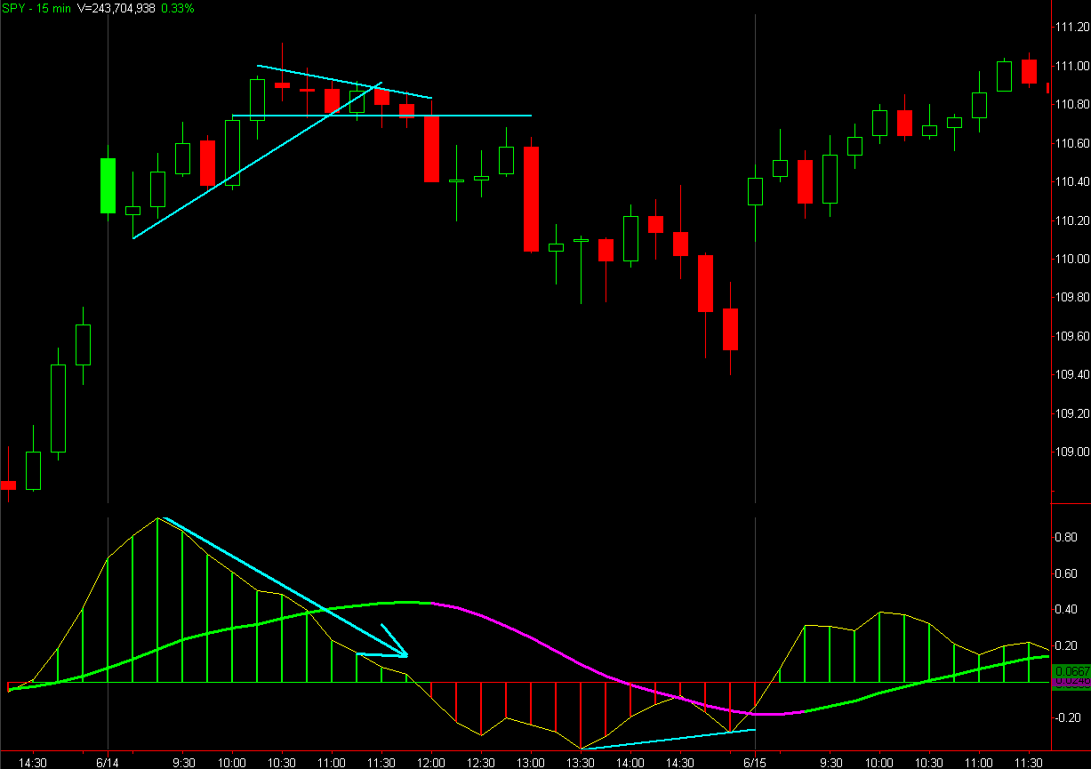
Below, simply the fast line going up shows price moving up and the fast line moving down coinciding with price moving down:


There are some instances (a short squeeze environment in particular) where the 3/10macd fast line is not necessarily indicative of price direction.  Just because momentum (this IS a momentum oscillator) is decreasing does NOT mean price "should" be decreasing (in fact, the reason it may be going up is because short sellers keep getting stopped out).  So, context is critical.


Now, retaining the Daily chart's information, we can incorporate an intra-day time frame to give us a dual time frame context.

 In the 30-min chart below I included a macd histogram that depicts what is happening on the daily chart (top subgraph) while the lower subgraph indicates the regular 30-min 3/10macd.
We are looking at the location and slope of the slow line for a higher time frame direction bias while using the intra-day 3/10 macd as a timing mechanism, but don't forget to take the long-term trend (20- & 50- SMA's) into consideration.
So, in the chart below, the long-term trend (20- & 50-SMA's) is bearish, but the Intermediate trend (higher time frame 3/10macd) is clearly bullish ("bullish" only in the sense that the average smoothed price is increasing for the time being).  Being that the "long-term trend" is bearish we can consider a long entry as being "counter-trend" and, therefore, having a shorter holding period.


This is a bigger edit than I was anticipating.....I am going to leave the remainder of this blog post as it is, though it doesn't quite segue well with the information above.


Now what?:
Now you have a direction bias.  In this case, the bias is bullish, so one would look for setups that include (but are not limited to) bullish breakouts, pullbacks, fading lows.
Starting with the day in which our histogram went green (6/11) let's dial in to see if any signals were given.
This particular day was range-bound.  Following the (long-term) histogram change we got a bullish momentum divergence (on the traded time frame) right at an intra-day support level.

Now let's move to the following day which proved difficult for our bullish bias (as an aside; just because a bias is bullish doesn't mean price won't pull back, retrace, flash-crash, etc.) 
We got a late-day run-up in price (momentum) that carried over into this day (bullish so far).  Price didn't give up the gap and with our bullish bias we were looking to trade a pullback or breakout, which we got in the morning session.  It was at this point that price stalled.

OK, so what happens after momentum in price?  Pullbacks (and buyers looking to enter in pullbacks) happen after momentum in price.  We just never know how steep the pullback will extend (how interested buyers are).
A couple of things to look at:
Higher intra-day time frame told us momentum kept dropping as price advanced (bearish)

While our trading chart shows us more evidence of lagging prices

Just because we have a bullish bias doesn't mean we can't take a counter-trend trade, like perhaps a First Cross Sell signal (red vertical dash line) as long as we have realistic targets in mind.  Also being aware that towards the end of the day both intra-day time frames (5- & 15-min) were showing a bullish momentum divergence (and the next day happened to be a trend-day up, the type of day you need to completely ignore the 3/10 macd).
OK, let's take a look at the next few Bullish Bias days after the trend day up until the bias changed bearish:
Something worth noting; If your bias is bullish and your bullish setups aren't working so well and maybe you see better bearish setups, then price is telling you something.

So, to sum it all up; When using the 3/10 macd we're looking at it's:
Fast line Value - (the color of the histogram; Green = above zero line, Red = below zero line)
Slope - is the fast line (and/or the slow line) increasing or decreasing  in value?
Relation of the slow line to the fast line - is the slow line supporting or resisting the fast line?

Well that's all I have for now on this topic, hopefully it was a better explanation of the 3/10 macd than has been provided in the past.

Saturday, October 16, 2010

Updated charts from previous post.  Momentum in the Nasdaq (or at least a few select names within) won't let the ship sink (or even correct for that matter).

Thursday, October 14, 2010

Saturday, October 9, 2010

Learning...

...to see different timeframes within the one:
weekly chart of RIMM
In an attempt to filter out some noise, you can see things differently.  For instance; grouping a number of bars together (5-weeks per bar in this case).  This is helpful in highlighting consolidation areas and momentum.   

angles

Just making an observation.  Move along, nothing to see here.
 An observation in a way to gauge momentum and speed of price (pace, if you will) using 5 primary angles (7 really, but 90° being straight up and the 0°/180° plane being horizontal, we can get by with just the 5).  Those angles being 15°, 30°, 45°, 60°, 75°. 
{Warning} there are NO Holy Grails in trading.  That being said, these angles aren't meant to be a sell here, buy there strategy.  Much the way trendlines are better drawn with a crayon rather than a pencil (so as not to get caught up in jumping to conclusions without confirmation), these angles have some degree for margin of error.
See if you can determine the strength of price when you extend these angles off of pivotal levels.  Oh that's right, I told you to move along...
RIMM 60-min chart. 
Some observations:
initial momentum spiked at a 75° angle.  The first higher low occured right around the 15° angle.  Price has since trended along that 15° plane, which gives the impression of uncertainty.  One thing in particular which jumps out at me is the lower high sell-offs.  Right around 9/25 price made a lower high and sold off with strong momentum before consolidating at the 15° line.  More recently, price made another lower high (around 10/05) wherein price sold off with strong momentum before consolidating just below the 15° line and putting in a higher low.  Price recovered, but not with the strength it has in the past, which leads me to believe it may be running out of fumes.  If I'm wrong, the momentum up would be an obvious tell.

Here's RIMM back in July where it displayed more strength, in the way it formed a bottom and the momentum that lifted it off it's lows:
Once price returned to that gap level there was a long period of sideways consolidation

Here's a weekly chart where I used a point in price and time where price broke out and continued with strong momentum:


The S&P weekly chart after coming off of it's '09 lows.  Again, this isn't to show coincidental price breaks or Support/Resistance (though you can watch for them if they display momentum), but more to highlight how price travels before running out of steam in one direction and picking up steam in the other.
Here's a monthly chart of the S&P using the '02 lows as a pivot:
Strength the whole way along the 45° line, failure, retest, speed.
 How about the S&P going back to it's breakout point back in 1995:


So, what's the angle of the dangle?

Thursday, October 7, 2010

wicks

Wicks can be a distraction, and what do they highlight?  Profit taking, stop sweeps, etc.
Here's Crude Oil future's on a 30-min chart
Here's price on strictly an Open to close basis, no highs or lows included:
 An interesting perspective for reading momentum and corrections in price.

Wednesday, October 6, 2010

inside day

Applying a concept from a previous post, here's an intra-day example of using the largest range that corrected greater than 100%.
The example being the SPY from Wed. Oct. 6th.  There was an impulse momentum move 25-minutes into the open, that was erased (retraced > 100%) within 45-min.
Once this range was established, it is projected off of the next swing high/low, like so:
Once price displays some stability (look for a momentum bar) we can project this range off of the lows and see if we get a breakout:

Price corrects, and we look to see what will progress within the box:

In this case, price holds AGAIN within it's boundary:
We now get another ranger wherein price corrected 100% of it's momentum move:
We could either project this range off of the swing high, but that would just put the box at the previous lows, an obvious support level.  So, we can instead project the box off of the swing high (lower high) that followed, in which case it gives us an ultimate line in the sand:
 Price finds support, and we use this box projected off of the lows:

Towards the end of the day, price breaks out from this box and bounces between the Open price and the upper boundary of this box.  Considering today was an inside day following a trend day, these last 20-minutes provided a solid range for scalping: