The setups I include on this blog are used in conjunction with the 3/10macd and the criteria I ascribe to it as a way to alert me to an existing condition of price. The key concept to take away from this blog is that I try to anticipate what will happen on the higher time frame by using a faster time frame to trigger the trade setup. I do not trade a "system" I use two indicators to clue me in to price conditions. Please read the Disclaimer located in the sidebar of this site. I can be contacted via email at toddstrade@gmail.com
I am always open to questions, comments, or suggestions on how to improve this blog.


Showing posts with label pace. Show all posts

Wednesday, October 27, 2010

long in the tooth

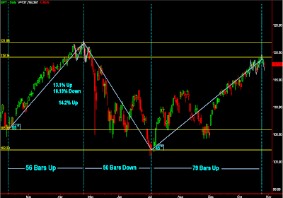
Price is beginning to yaw.  We're gaining less ground over more time.

From the July lows our advance has brought us up just over 14%

this was following a decline of over 16% off of the April highs and, before that, a 13% advance off of February lows.
The energy is fading (not to say a renewed energy couldn't take price up for another wave).  It has taken 79-days for price to come this far off of it's correction lows;  compared to 56-days up and 50-days down (can you say cycle?).

Saturday, October 9, 2010

angles

Just making an observation.  Move along, nothing to see here.
 An observation in a way to gauge momentum and speed of price (pace, if you will) using 5 primary angles (7 really, but 90° being straight up and the 0°/180° plane being horizontal, we can get by with just the 5).  Those angles being 15°, 30°, 45°, 60°, 75°. 
{Warning} there are NO Holy Grails in trading.  That being said, these angles aren't meant to be a sell here, buy there strategy.  Much the way trendlines are better drawn with a crayon rather than a pencil (so as not to get caught up in jumping to conclusions without confirmation), these angles have some degree for margin of error.
See if you can determine the strength of price when you extend these angles off of pivotal levels.  Oh that's right, I told you to move along...
RIMM 60-min chart. 
Some observations:
initial momentum spiked at a 75° angle.  The first higher low occured right around the 15° angle.  Price has since trended along that 15° plane, which gives the impression of uncertainty.  One thing in particular which jumps out at me is the lower high sell-offs.  Right around 9/25 price made a lower high and sold off with strong momentum before consolidating at the 15° line.  More recently, price made another lower high (around 10/05) wherein price sold off with strong momentum before consolidating just below the 15° line and putting in a higher low.  Price recovered, but not with the strength it has in the past, which leads me to believe it may be running out of fumes.  If I'm wrong, the momentum up would be an obvious tell.

Here's RIMM back in July where it displayed more strength, in the way it formed a bottom and the momentum that lifted it off it's lows:
Once price returned to that gap level there was a long period of sideways consolidation

Here's a weekly chart where I used a point in price and time where price broke out and continued with strong momentum:


The S&P weekly chart after coming off of it's '09 lows.  Again, this isn't to show coincidental price breaks or Support/Resistance (though you can watch for them if they display momentum), but more to highlight how price travels before running out of steam in one direction and picking up steam in the other.
Here's a monthly chart of the S&P using the '02 lows as a pivot:
Strength the whole way along the 45° line, failure, retest, speed.
 How about the S&P going back to it's breakout point back in 1995:


So, what's the angle of the dangle?

Friday, August 27, 2010

Momentum Buy Divergence

Signaled across the board today, was a momentum buy divergence on the 3/10 oscillator (daily chart). A handy dandy indicator to use when price is cycling, as it is now (as opposed to trending, and has been ever since the flash-crash).
DIA (green vertical lines indicate the divergence buy signal. Red vertical line represents a divergence sell signal),
SPY
QQQQIWM - Actually triggered yesterday and again on Tuesday.SMHIYT
The biggest problem at this point is the overhead resistance (a.k.a. SUPPLY). One can't expect a "Death Cross" to mean an immediate rejection of price. There are bound to be some short-covering, dip-buying rallies.Essentially, what it all boils down to is that the coming bounce should determine whether we probe lower (for a lot of, so far, untested price levels below), or higher (within the range we currently find ourselves in, up to around $113). It is critical, because "pace" (the bounces off of support we have experienced) is quickly fading.
Just as an aside, here's a good example of why the 3/10 oscillator isn't ideal in a trending market. Unless of course you use the signals as a contrary indicator.
CF

Monday, June 28, 2010

just sayin

AMZN...a lot of clear air below. Consumer Confidence numbers come out tomorrow...just sayin'.

Thursday, June 24, 2010

Will it bounce!?

Shortly we should see a bounce or drown moment for AMZN. Perhaps a bounce higher could bring price back to $140 given a strong market headwind or, at least the midline of $135.
While to the downside, $110 is the low from an Oct. '09 momentum gap up, and $93-ish would be a gap fill and previous Resistance-turned-support level.
The previous two bounces were weak but it should be apparent very soon which way the crowd is leaning.

Saturday, June 19, 2010

When the ball stops bouncing

FSLR weekly in a descending triangle. Sure this past week's big green bar looks promising, but we don't have to look too far into FSLR's history to see that these bars don't necessarily preclude continuation and aren't anything more, at this point, than a sign of short covering at support. It seems the only thing keeping this issue afloat is a weekly promise by our president that alternative energy is our saving grace. By the looks of it though, unless price can get beyond $150 in the near-term, price may be looking to dip it's toes below the $100 water-mark as buying interest wanes.This will be an important week or two for FSLR in gauging the overhead supply present at higher price levels and overall demand at lower price levels. The more often a supported price is tested the more people begin to believe it can test lower, especially if it is showing lackluster demand (as FSLR is showing here). A timely return to $100 may be quite bearish.
I will be updating this chart regularly.
This price action concept was covered recently at this link.

Thursday, June 17, 2010

Sunday, June 6, 2010

weekly pitchforks

Some weekly charts with a long-term Andrews Median Line drawn into the major swing highs/lows. The Andrews Pitchfork is an aid to visualize the change in velocity of price over time, based on action and reaction (A-B-C pivots, where A-B actually captures the "action", and C captures the "reaction".). As such it helps to highlight buying/selling weakness as price approaches an extreme (Upper/Lower median lines and center line).
Here is POT weekly chart. I drew this one when I first started reading about pitchforks and thought to myself; nah, this is bogus...We got two good instances of price tagging the ascending Lower Median Line (LML) and bouncing higher. More recently, however, rather than bounce, price consolidated at the LML before breaking down, indicating that the buying pace has weakened.
RIMM has a similar story as the POT example above; A couple of bounces at the LML before breaking down. RIMM stands at an awfully pivotal level here, a lot of price discovery above and clear air below.
FCX is a really nice example of Support-turned-Resistance-turned-Support, as well as sideways consolidation levels preceding a breakout. Here, price tested the Center Line 4-times. However, the first three times were higher highs, the fourth instance was a lower high reversal pattern.The most recent reversal in FCX being a "seed wave" we can get potential targets for Wave3 & W5:
SPY: doesn't look too good :/
The fact that we bounced so hard off the 2009 lows gave a lot of untested price levels. Price failed to tag the Center Line which is supposed to increase the likelihood of a test of the LML, if not the C-pivot low.However, if you draw the pitchfork from the '94 lows to the '07 highs and back down to the '09 lows then you do get a successful test of the center line.:

Take a look at the previous SPY projection based off of the 1994-1999-2002 pivots. A few things can be learned from this chart:1. Price came back to test the LML after forming the "C" pivot (which turns out to be a great long setup if one is quick to respond).
2. Price fails to touch the Median line before breaking down, giving two possible targets (1. the Warning Line and 2. the C-pivot lows).3. The price behavior between 2004-2006 displays choppy, ascending movement that gives you an opportunity to include sliding parallels (included below).
Finally, here's a look at a weekly Dow Jones Industrial Average chart (log-form) going back to 1928 with a Modified Schiff variation pitchfork overlayed.

Friday, June 4, 2010

bounce

Take a look at FXE (Currency Shares Euro Trust) and how the breakdown from support was gradual and gave opportunities to judge the real buying interest along the way.It appears that the lower highs resulting from the 5/27 rally, and the subsequent failure test on 5/28, really sealed the fate for further testing to the down side. The "pace" showed a complete lack of buying interest before falling off a cliff.
Now, take a look at the S&P500 index at the 1070 level.and similarly, @ES
This isn't a prediction that we will drop into a lower low abyss, just a way of taking comfort in the fact that if we do drop into the abyss, at least we should have time to react. Notice on the ES how price consolidated into a tight range before giving up the 1107 level.

Also for consideration on this topic, the Dow Jones Industrial Average:

Wednesday, June 2, 2010

1 bounce 2 bounce

Updated chart at the bottom:

Most recently, the SPY has bounced twice from $105, and it's a very long-standing Support/Resistance level.The more we test $105 and the weaker the bounces get can result in things getting very messy sub-$105.The first bounce saw relative support at each Fib. level between the "flash crash" low and it's bounce pivot, particularly that of the 61.8%-78.6% retracement levels.The recent bounce and tomorrow we'll see what kind of support we get out of the 50% retracement level. We should be able to gauge buying interest soon in terms of whether we'll see a lower low.
Waiting to gauge a reaction off of $107
updated chart after today's session:
got sold off of the Upper Median Line only to come rallying back strong.

Tuesday, February 2, 2010

XOM

Exxon Mobil (XOM) was upgraded today after earnings yesterday that announced a 23% haircut in profits from the previous year (a mere $6-billion dollar profit). So, is it coincidence that they are today upgraded (currently the stock price isn't behaving like it has had good news), or could the timing get any better in order to help institutions lighten up their holdings in this issue now while they still can?
Here's a chart going back to 1968 that speaks volumes in terms of being close to an inflection point:
and zoom in a little closerPerhaps it could bounce from here after hitting lows last week not seen since March '08. However, this stock has been under the thumb of the 200-MA for nearly two years now, and while bounces out of the $64-range have been common, they're not drawing as much buying as they once did. It will be interesting to watch what develops.